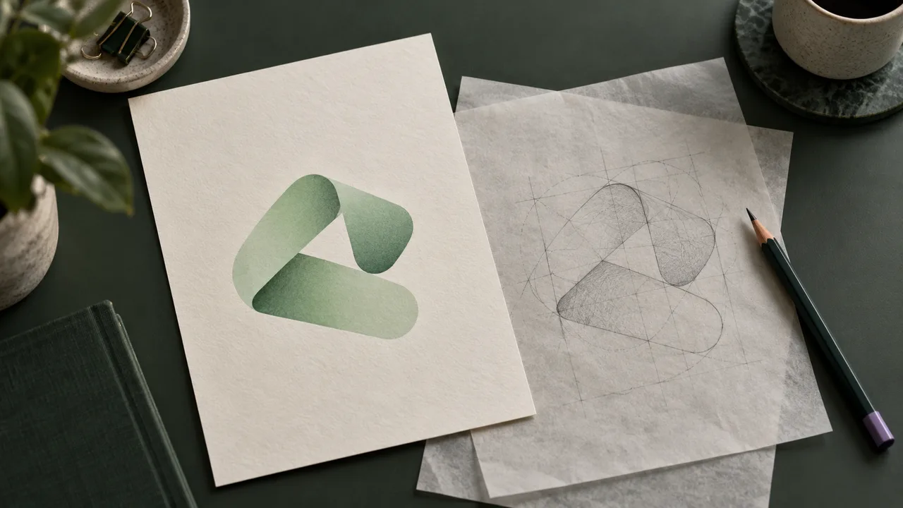
You have a logo that looks fine in an email signature, but the website designer wants an SVG. Or the only copy in the shared drive is a small JPG, and enlarging it makes the edges soft. Vectorizing the logo means reconstructing those pixels as editable shapes.
The quickest useful workflow is: choose the clearest source, upload it, compare the trace, correct any important defects, then export the SVG. This guide follows that job through Vectali and uses downloadable results to show what deserves attention before you hand the file over.
If you already have an approved SVG or another vector master, start there. Tracing a PNG is useful when the geometry is missing. It does not recover the designer’s original layers, font choices or construction.
Open the logo converter if you want to follow along. Previews are unlimited; a free account includes three SVG exports total, with no card required.
1. Choose a source with the details you need
Start by looking in the brand folder, previous website assets or the original design handoff. Ask the designer for the vector master if that is possible. Ten minutes finding the right file can save an hour repairing a trace of a thumbnail.
When only raster copies remain, compare the actual images. A 1,200-pixel file is not automatically better than a 400-pixel one: it may simply be an enlarged version of the same small source. Look at a curved edge and the smallest lettering at their original size.
Prefer a clean export over a screenshot. Screenshots may include a background, scaling from the browser and nearby interface elements. A JPG can contain compression noise around letters; a PNG can preserve those same defects if somebody previously converted the JPG to PNG. The extension tells you how the present file is stored, not its entire history.
Choose a transparent PNG when you have a good one. Keep a clean JPG if it contains clearer shapes than the available PNG. Vectali accepts both. The PNG converter and JPG converter lead to the same browser engine, with guidance specific to each input.
Before proceeding, identify three features you need to preserve. For a wordmark, write down the opening in an “e,” the spacing between two letters and a thin crossbar. For a symbol, pick a sharp corner, a small gap and an isolated dot. These become your acceptance checks later.
2. Prepare the image without changing the logo
Crop away unrelated content, such as a browser toolbar or a neighboring caption. Keep intentional clear space if it belongs in the delivered asset. A crop that touches every visible edge may clip a stroke or make later placement awkward.
Avoid sharpening, blurring or enlarging the image just to make it look cleaner before tracing. Those edits change the boundaries the engine sees. If you try a preparation step, save it as a separate copy so you can compare both inputs against the original.
Check the dimensions as well as the file size. The browser converter accepts PNG or JPEG files up to 10 MiB, with at most 4,000,000 pixels and no side above 4,096 pixels. A 2,000 × 2,000 image reaches the pixel limit; a 3,000 × 2,000 image exceeds it even if its compressed file is small.
Those limits describe accepted inputs, rather than a promise that every complex image will finish. If a large image struggles, crop unnecessary canvas or reduce its dimensions, then check that the small features still exist. The file-limits reference distinguishes browser limits from the smaller server API allowance.
For a blurry source, decide whether the missing information is recoverable before spending time on settings. If two letters have merged into one dark patch, a converter has no reliable evidence of their original separation. Our low-resolution logo guide walks through that decision.
3. Upload the logo and make the first comparison
Choose the file in the converter and let the preview finish. Vectali runs its own Rust conversion core in your browser through WebAssembly. The landing converter does not save the image to account history.
Begin with the comparison view. Move the divider across the entire mark, including its internal openings. Compare at the intended display size first: a website header, a product label or the size requested by the recipient. A logo that looks impressive when enlarged can still lose its identity when reduced.
Then inspect the vector and path views. The vector view shows the resulting artwork; the path view helps you understand its geometry. Treat the path count as an inventory measurement. It cannot tell you whether a curve is in the correct position.
Do one first pass without changing anything. Note a specific defect if you see one: “the opening in the lower letter closed” is actionable; “the quality seems off” is difficult to diagnose. Keep the same input while evaluating a setting so you can attribute the difference to that change.
In the signed-in dashboard, color-count controls let you compare alternative palettes. Start from the automatic result. Fewer colors can remove unwanted edge fragments, but can also merge a small accent into its surroundings. Pick the result that preserves the intended mark, rather than the smallest number in the controls.
4. Work through a real example: the React atom mark
Our recorded React conversion starts from a 128 × 128 PNG rasterized from the official repository’s SVG. The PNG, rather than the original vector geometry, was passed into Vectali. The published output is the unedited SVG from that run.
128 × 128 PNG input

Unedited SVG output

Follow one ring through its crossings, then inspect the enclosed gaps and central dot. In this run those features remain present. Small changes in ring thickness and curvature remain near the crossings. A recognizable symbol and a smooth outer edge do not establish an exact reconstruction.
The output contains two path elements and occupies 6,910 bytes, compared with 10,210 bytes for this particular PNG. Those numbers describe these files. They do not establish that all two-path outputs are good or that every SVG will be smaller than its input.
You can download the PNG and inspect the SVG yourself. The benchmark’s method and limitations identify the engine snapshot, input preparation and evaluation process. This is a selected example, not an independent study of arbitrary customer logos.
Apply the same inspection to your own mark. If your logo has lettering, substitute the letter openings for React’s ring gaps. If it contains a detached accent, use that as the equivalent of the central dot. The aim is to check features with a job, rather than admire the outline in general.
5. Decide what to fix before exporting
A trace can be useful without being the final approved artwork. The next step depends on the defect, so choose a repair that addresses the cause.
| What you see | First thing to investigate | Useful next step |
|---|---|---|
| A small gap has closed | Is the gap visible in the original pixels? | Try a clearer source; otherwise redraw that opening |
| A pale fringe on a dark surface | Does the source already have a light edge? | Clean the source edge or edit the affected shapes |
| A tiny accent disappears | Has its color merged with a neighboring region? | Compare palette settings in the dashboard |
| A white rectangle surrounds the mark | Is it a real background object? | Select and remove only that object if unwanted |
| A curve is smooth but asymmetric | Is the asymmetry present in the source? | Adjust the vector against an approved reference |
| Text is hard to read | Are its strokes distinct at source size? | Obtain the original wordmark or rebuild the lettering |
Avoid fixing one feature at the expense of another. A palette that removes a fringe may also remove a white highlight. A simplification that makes the outside smoother may close a narrow interior gap. After each edit, recheck the three features you selected at the start.
If the destination is a small header, inspect the whole logo at header size. If it is a large sign, inspect the curves at the enlarged delivery scale as well. You are approving an asset for a use, not trying to make one zoom level look perfect.
6. Check transparency and lettering separately
Put the SVG on a light surface and a dark surface. A transparent canvas, a white background shape and a pale outline around the logo are three different conditions. Removing one background object will not necessarily repair edge colors already traced from the source.
A JPG has no transparent alpha channel. Its white backdrop is image content. A transparent PNG may still contain edge colors produced during an earlier export against white. Use the transparent SVG troubleshooting guide to distinguish the background from the edge before changing the artwork.
Inspect white details deliberately. The inside of a letter may be a transparent opening, or it may be a white shape placed over another shape. Both can look identical on a white page and behave differently on a dark one. Deleting every white object is an easy way to damage a logo.
Traced letters become shapes. They can be resized and edited as geometry, but they are not automatically editable text. The converter does not identify the font or recover the original kerning settings. If someone needs to change the company name, ask for the design file and licensed font rather than promising that the SVG will behave like a text document.
For a strict brand reproduction, compare against the approved master. If you only have a poor screenshot, be clear with the recipient about which details were reconstructed. A trace is a starting point for review, not a new source of brand authority.
7. Export an SVG and check the delivered file
Sign in when you are ready to download. Vectali’s free plan includes unlimited previews and three SVG exports total. Additional browser exports follow the current web plans; server API conversions use a separate allowance.
Open the downloaded file in the vector editor you intend to use. Select the artwork and check that the expected shapes are available. Groups may need to be entered or ungrouped before their individual objects can be selected.
An .svg extension alone does not prove that a picture has become vector geometry. SVG supports raster images as well as shapes, as documented in the SVG specification’s overview. Our SVG inspection guide includes a path-based example and an embedded-image wrapper so you can recognize the difference.
Check the frame too. If the logo looks unexpectedly small when placed on a page, the file may contain generous canvas space. Fix the SVG viewBox and framing rather than increasing the CSS width until the surrounding layout breaks.
Keep three versions in the handoff folder: the original raster, the untouched conversion and the approved edited SVG. If the recipient needs a PNG, export it from the approved vector at the requested dimensions. Tell a printer which file is the approved artwork and ask for its format, color and production requirements.
When automatic tracing is enough—and when to redraw
Automatic conversion is a good first attempt for a clear logo made of distinct shapes. It gives you inspectable geometry quickly and lets you judge the result before spending time on manual construction.
Redrawing becomes the more direct route when important information is absent: unreadable small text, a blurred border between two shapes or a geometric symbol that must have exact symmetry. Repeating the same trace cannot establish where a boundary originally belonged.
Inkscape provides a manual alternative through its tracing tools; its tracing guide explains the raster-to-path workflow. Use manual editing where it saves time, especially for a few straight edges or a known typeface. You do not need to rebuild an entire logo because one part needs correction.
A useful stopping point is concrete: the identifying details survive, the background behaves correctly, the file contains the objects the recipient needs, and it works at the intended size. Preview your own logo, inspect those details and export when the result meets that job.